
Balancing Brand Storytelling with Functional Design for Three Oaks Golf Center

One of the biggest challenges in brand identity design is creating something that tells a compelling story while still holding up in the real world. A beautiful concept on a monitor doesn't mean much if it turns into an unrecognizable blob when embroidered on a polo or stamped onto a golf ball.
For Three Oaks Golf Center, the goal was to create a modern identity that elevated their retail pro shop while still honoring the welcoming, family-owned atmosphere they had built over the years.
Finding the Balance
The story behind Three Oaks was the foundation of the design. The final mark combines a majestic oak tree canopy with a trunk structure built from three golf clubs: an iron, a hybrid, and a driver. The design honors both the three brothers who own the course and the three oak trees that define the property.
The challenge was making sure that story could survive outside of a single logo file.
Early concepts explored a more detailed, illustrative approach to the oak canopy. While visually rich, the fine leaf details created problems when thinking about real-world applications. Small details can disappear in embroidery, fill in during printing, or become difficult to reproduce at smaller sizes.
By simplifying the canopy into a bold, graphic shape, we were able to preserve the story while creating a mark that could actually be used across signage, apparel, and merchandise.
Turning Feedback into a Tiered Asset Package
One of the most important parts of identity design is understanding that one logo cannot do every job. A storefront sign, an embroidered polo, and a golf ball stamp all have different requirements.
Based on client feedback and production needs, we developed a tiered logo package with three distinct versions:
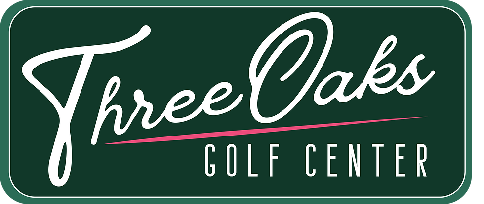
The Building & Signage Badge: A complete, premium brand identity system. This primary lockup sets the tree mark inside a classic geometric frame, pairing an elegant, vintage script with a grounding sans-serif typography: perfect for physical storefronts, signage, and large-scale clubhouse assets.

The Apparel Logo: A streamlined version of the tree mark optimized specifically for textiles. By fine-tuning the optical spacing between the club heads and carving out deliberate negative space, this version holds up beautifully for direct-to-garment printing, patches, and left-chest embroidery on performance polos.
The Distinct Brand Icon: A standalone, high-contrast icon stripped of all text. This punchy, ultra-scalable mark is designed for maximum clarity at micro-sizes: making it ideal for social media avatars, digital app icons, and physical applications like custom golf ball stamping.

The Takeaway
Effective identity design isn't just about creating a great symbol; it's about building a system that works.
By balancing the story behind Three Oaks with the practical realities of production, the final identity gives the business a flexible toolkit that can grow with them, from a 10-foot storefront sign to a 1-inch golf ball.


Comments